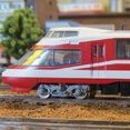
bill937ca Posted May 9, 2023 Share Posted May 9, 2023 Today, the E259 Series renewal was unveiled at the Railway Museum. The E259-type renovated car has arrived The E259-type vehicle is active as the "Narita Express", and it features white, black, red, and gray coloring inherited from the first generation's 253 series. However, this time, the design of the leading vehicle will be renewed with the concept of "the evolution of the new E259 system" (via a press release). In the new design, the logo of the "SERIES E259", a format name in a silver-tone coloring ring, is enlarged on the front and the sides, expressing the image of the "Narita Express" and the evolution of its evolution in addition to airport access, diversified use for commuting and leisure. In the future, other E259 models will also be renewed sequentially, and there will be more opportunities to see them as the face of the new "Narita Express". Here is a preview from about 10 days ago as seen at the Omiya General Rolling Stock Center. 2 Link to comment
katoftw Posted May 9, 2023 Share Posted May 9, 2023 Light grey and white? Kinda liked the striking red, white and black better. Link to comment
Wolf Posted May 9, 2023 Share Posted May 9, 2023 "the evolution of its evolution" Err, what? 1 Link to comment
bill937ca Posted May 9, 2023 Author Share Posted May 9, 2023 I'd say it is what it is. 1 Link to comment
Takahama Trainwatcher Posted May 10, 2023 Share Posted May 10, 2023 Along similar lines (I don't know if this has already been posted), after videoing a train at Takahama a couple of weeks ago, it triggered with me when I watched my recording that the E657 captured had a different colour scheme from the usual one. A little bit of research reveals that, rather than the E657 having a "renewal", they are having a "revival" of the colour schemes of the E653 when they operated Fresh Hitachi services. Info available at https://en.wikipedia.org/wiki/E657_series#Special_liveries . There are some YouTube videos now, too (e.g. ). 2 Link to comment
JR East Posted May 10, 2023 Share Posted May 10, 2023 22 hours ago, bill937ca said: The E259-type renovated car has arrived [...] In the new design, the logo of the "SERIES E259", a format name in a silver-tone coloring ring .... No words for that. Of course it's a matter of colors & feeling... for me just one word : ugly. I definitely don't like it. I'm in Tokyo in Sept (if everything remains aligned) and I'll ride the Skyliner. Link to comment
jappomania Posted May 10, 2023 Share Posted May 10, 2023 noooo.....💩the NEX was already perfect, both, old and new, why? 😥 instead the result of revival E657 Fresh Hitachi like me a lot, anyway in both case a lot of job for Kato, if they would Link to comment
bill937ca Posted May 10, 2023 Author Share Posted May 10, 2023 This is the best image I have seen of it yet. It only affects the lead car. Text in Japanese. https://rail.hobidas.com/news/451871/ 1 Link to comment
bill937ca Posted May 10, 2023 Author Share Posted May 10, 2023 Here it is in the flesh. Text in Japanese. https://rail.hobidas.com/news/451871/ Link to comment
jappomania Posted May 10, 2023 Share Posted May 10, 2023 😌.... https://2nd-train.net/topics/article/47165/ 😖 1 Link to comment
bill937ca Posted May 10, 2023 Author Share Posted May 10, 2023 Somebody clean the whole windshield!!!!!! 2 Link to comment
railsquid Posted May 11, 2023 Share Posted May 11, 2023 Great, dark grey squared numbers on a grey background... good thing it's not meant to convey any actual useful information. 1 Link to comment
disturbman Posted May 11, 2023 Share Posted May 11, 2023 I also think it's a regression in terms of design and it would have been better to keep the name of the service rather than maximizing the name of the train series. However, I suppose we can expect this to become more of the norm on JR East network as this new design is close to the one used on the E353, though using a different font. Link to comment
jappomania Posted May 11, 2023 Share Posted May 11, 2023 why to pay a "designer" (in this case I want my money back) instead to copy what someone already imagining, sometime with better results if you want a "family feeling" with E353 switch the purple stripe to red and is done, add a couple of NEX logos.. (not 24-25 in Kyushu Shinkansen style..) or something different... and more.... http://metro6023.blog.fc2.com/blog-entry-316.html also the "microwave" commuters have a better livery, and painting a brick on the bogies to become attractive is not so easy.. 3 Link to comment
miyakoji Posted May 11, 2023 Share Posted May 11, 2023 I think usoden came up before, am I recalling correctly that @bikkuri bahn doesn't like them? Some are pretty far out but the E259 in 255 series Boso View colors looks good to me. I also remember seeing a typical 113 series or whatever in stainless steel a la EF81-300. I wasn't wild about the look but the photoshopping was well done. Link to comment
Doddy Posted May 12, 2023 Share Posted May 12, 2023 (edited) On 5/11/2023 at 11:01 AM, railsquid said: Great, dark grey squared numbers on a grey background... good thing it's not meant to convey any actual useful information. Funny, I've have the same issue with this forum's readability. 🤣 Small fonts, grey text on a white background etc... LoL Edited May 12, 2023 by disturbman Link to comment
Wolf Posted May 12, 2023 Share Posted May 12, 2023 (edited) 1 hour ago, Doddy said: Funny, I've have the same issue with this forum's readability. 🤣 Small fonts, grey text on a white background etc... LoL Never had that issue. But no clue how accessible it is for visually impaired ppl tbh Edited May 12, 2023 by disturbman Link to comment
Recommended Posts
Create an account or sign in to comment
You need to be a member in order to leave a comment
Create an account
Sign up for a new account in our community. It's easy!
Register a new accountSign in
Already have an account? Sign in here.
Sign In Now