ATShinkansen Posted March 29, 2023 Share Posted March 29, 2023 I've been drawing up diagrams to go with each group of turnout throws as they will be placed around the layout. I wanted to post them here, not just to share, but also to ask for feedback, as I want them to have a somewhat professional appearance (don’t be afraid to be nitpicky!). All text is hiragana and kanji as well as English, as it’s also a language exercise. I was careful to pick Helvetica font, as I think I saw somewhere on the forum about it being the standard font used in stations. Red boxes indicate groups of turnouts controlled by a single lever. I have one more to create for the freight yard that I haven’t even begun to figure out the track plan. Link to comment
ATShinkansen Posted March 29, 2023 Author Share Posted March 29, 2023 I'm not satisfied with the font for the Japanese text. It looks nothing like what I see on standard signage. Link to comment
bill937ca Posted March 30, 2023 Share Posted March 30, 2023 (edited) Kanto area station fonts. (5 pages). https://mitok.info/?p=112655 Station name sign (JR East) https://shikaku-kenkyujyo.com/column/font/ Edited March 30, 2023 by bill937ca 3 Link to comment
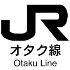
ATShinkansen Posted April 1, 2023 Author Share Posted April 1, 2023 I was able to locate the correct font style for a reasonable price (apparently it’s called “New Rodin”). This looks much better: And while I’m at it, I decided to make a nameplate for the railway: 5 Link to comment
Recommended Posts
Create an account or sign in to comment
You need to be a member in order to leave a comment
Create an account
Sign up for a new account in our community. It's easy!
Register a new accountSign in
Already have an account? Sign in here.
Sign In Now